Posted
by Big Gav
in
limits to growth,
maps
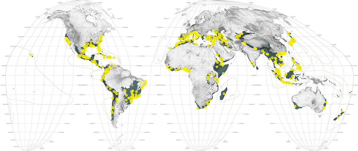
Richard Weller has written "an atlas for the beginning of the anthropocene" - Atlas for the end of the world.
Coming almost 450 years after the world's first Atlas, this Atlas for the End of the World audits the status of land use and urbanization in the most critically endangered bioregions on Earth. It does so, firstly, by measuring the quantity of protected area across the world's 36 biodiversity hotspots in comparison to United Nation's 2020 targets; and secondly, by identifying where future urban growth in these territories is on a collision course with endangered species.
By bringing urbanization and conservation together in the same study, the essays, maps, data, and artwork in this Atlas lay essential groundwork for the future planning and design of hotspot cities and regions as interdependent ecological and economic systems.
Posted
by Big Gav
in
maps
Apparently Beavis and Butthead became cartographers when they eventually finished school - Rude Map Of The World.
Posted
by Big Gav
in
maps
Off topic, but I love these old maps and infographics - The Stunning Early Infographics and Maps of the 1800s.
Posted
by Big Gav
in
africa,
maps
Posted
by Big Gav
in
maps,
population
Strange Maps has a great example of how we could reduce our population footprint, if we chose to - The United States of Brooklyn, NH.
Posted
by Big Gav
in
australia,
mapping,
maps,
renewable energy
Renewable Energy News has a report on a newly released online atlas of renewable energy resources - Australian Renewable Energy Atlas Launched. The atlas is a little slow and clunky, but its a great resource nevertheless.
Last Friday, Environment Minister Peter Garrett launched Australia's first interactive atlas designed to map all of Australia's renewable energy resources.
The Renewable Energy Atlas is a user-friendly online tool showing highly detailed, nationwide information on all forms of renewable energy including solar radiation levels, wave and tidal information, ocean currents, biomass, wind speed and geothermal (ground) temperatures. It also includes data such as energy infrastructure, power lines and power plants, roads, land tenure and climate information such as rainfall
The Atlas has been designed for use by the entire community; from householders and students interested in learning about Australia's renewable energy potential to planners and investors researching data for clean power generation projects.
Users can zoom into a specific area, even down to street level and then add and subtract layers from the map. At this point in time, solar radiation levels are described in mega joules per square meter annually, which is mostly useful to researchers. For householders and those generally curious about solar power potential in their area, the Energy Matters system builder tool will display kilowatt hours per meter squared per day for a given area which is probably more meaningful data when considering the design of an off grid or grid connect systems for home solar power.
The Renewable Energy Atlas has been funded under the Australian Government's Low Emissions Technology and Abatement Program as part of the nation's commitment to an MRET (Mandatory Renewable Energy Target) of 20% by 2020 and will continue to be developed on an ongoing basis by the Department of the Environment, Water, Heritage and the Arts.
Posted
by Big Gav
in
epa,
google,
mapping,
maps
Christopher Haase has a post on a Google Earth overlay produced by the EPA (.kmz) showing contaminated sites that would be suitable for renewable energy production - EPA + Google = Woohoo!.
The U.S. Environmental Protection Agency (EPA) has released a Google Earth-based interactive website that pinpoints opportunities for solar, wind or biomass siting on contaminated properties. The site combines the Google Earth platform with an EPA database that lists each property’s attributes for renewable energy development.
According to the EPA, many lands tracked by the agency, such as large Superfund sites, and mining sites offer thousands of acres of land, and may be situated in areas where the presence of wind and solar structures are less likely to be met with aesthetic, and therefore political, opposition.
Many EPA tracked lands are in areas where traditional redevelopment may not be an option because the site may be remote, or have difficult environmental conditions that are not well suited for traditional redevelopment such as residential or commercial.
These EPA tracked lands also have key infrastructure already in place. Existing electric transmission lines and capacity, as well as roads, criss-cross many of the landscapes. In addition, most of the areas are adequately zoned for such development.
There are approximately 480,000 sites and almost 15 million acres of potentially contaminated properties across the United States that are tracked by EPA.
Maps for six types of energy, as well as non-grid connected wind and photovoltaic solar energy, for the entire nation are also available

Posted
by Big Gav
in
maps,
shipping
Mapping the world and the stuff that moves around it is one of the levers for building an energy efficient future, and I've always been a fan of maps, so I liked this roundup of various maps of our interconnected world that Ethan Zuckermann has posted at WorldChanging - Mapping a Connected World.
I’m fascinated by container ships. They’re my favorite metaphor for a connected world. When I visit port cities, I often try to drag friends with me to watch cranes load and unload stacks of interchangeable red, blue and grey boxes. For some reason, they’re often less enthusiastic than I am about sitting in a parked car in a bad part of town, watching the mundane aspects of global trade take place through a chain-link fence, one metal box at a time. (Then again, there are people who don’t find watching the blinking lights in a large datacenter fascinating either. I guess it takes all kinds.)
So, needless to say, I’m looking forward to the BBC’s new project, “The Box“. The folks at the Beeb have started a project with shipping line NYK designed to allow readers to track the movements of a single container over the course of a year. The container has been painted with a BBC URL and fitted with a GPS transponder, but otherwise will function as an ordinary container, carrying loads from one port to another. Its voyage will be visualized on a web map, giving viewers a sense for the vagaries of international trade. (Depending on whether BBC stacks the deck or not, this could also be a stunningly boring voyage, if the container simply cycles between Southhampton and Bruges.)
BBC says that the project was inspired by Marc Levinson’s excellent book, The Box. (My review of the book is here.) It could just have easily been inspired by William Gibson’s newest novel, Spook Country, which centers on the movements of a specific Maersk shipping container around the world. (Not his strongest recent book, but includes some excellent port scenes, so worthwhile for containerphiles.) Or by Brian Cudahy’s “Box Boats“, a useful complement to Levinson’s epic, focusing more on the evolution of ships and shipping lines and less on the containers themselves.
One of the goals of the BBC project is likely to help viewers visualize the complex networks that characterize our global world. It’s not hard to find examples of objects that seem to defy logic, but make perfect sense in a globalized world - Fiji water, for instance. But it’s harder to find good visualizations of the networks that underpin the connections between our different nations and economies. If we could map the travels of every container for a year, we’d likely learn a great deal about what countries are tightly connected to one another, about who exports to whom, when and how often. I’ve found it surprisingly difficult to find maps that show me where containers are going, either because construction of such a map would require cooperation of dozens of firms and hundreds of port authorities, or perhaps because such network maps would reveal vulnerabilities in global shipping networks. (If your goal is to get materials for a dirty bomb into the US, it would be useful to know what ports that regularly ship to Long Beach, CA are insecure. Fortunately, ABC already did this work for you - reporter Brian Ross packed 15 pounds of depleted uranium - very difficult to distinguish in terms of density and chemical properties than more dangerous forms of uranium - into a shipping container in Jakarta and sent it to Los Angeles. No problems with port security until ABC ran the story…)
I’m surprised at how few maps of networks I’ve been able to find, both in a daylong internet crawl, and in a pleasant though frustrating morning at the local university library....

One of my favourite maps sites, Strange Maps, only posts blog entries occasionally but its worth checking up on from time to time to see what the author's latest explorations have discovered. One recent entry is this map of Holland, showing how Dutch cities have warmed over the past decade by comparing them to French cities with the same average temperature -
Holland Warms To France.
Posted
by Big Gav
in
agriculture,
maps,
nasa,
offshore wind power,
solar power,
weather
REw has an article on NASA's effort to map offshore wind intensity, collected at the JPL Winds site - NASA Maps Reveal Wind Energy Sources.
Efforts to harness the energy potential of Earth's ocean winds could soon gain an important new tool, global satellite maps from NASA. Scientists have been creating maps using nearly a decade of data from NASA's QuikSCAT satellite that reveal ocean areas where the wind resources exist to produce wind energy.
The new maps could help developers better plan the locations of offshore wind farms. The research was funded by NASA's Earth Science Division, which works to advance the frontiers of scientific discovery about Earth and its climate.
"Wind energy is environmentally friendly. After the initial energy investment to build and install wind turbines, you don't burn fossil fuels that emit carbon," said study lead author Tim Liu, a senior research scientist and QuikSCAT science team leader at NASA's Jet Propulsion Laboratory in Pasadena, California. "Like solar power, wind energy is green energy."
Science Daily has more on the same topic -
Ocean Wind Power Maps Reveal Possible Wind Energy Sources.
Wind energy has the potential to provide 10 to 15 percent of future world energy requirements, according to Paul Dimotakis, chief technologist at JPL. If ocean areas with high winds were tapped for wind energy, they could potentially generate 500 to 800 watts of energy per square meter, according to Liu's research. Dimotakis notes that while this is slightly less than solar energy (which generates about one kilowatt of energy per square meter), wind power can be converted to electricity more efficiently than solar energy and at a lower cost per watt of electricity produced.
According to Liu, new technology has made floating wind farms in the open ocean possible. A number of wind farms are already in operation worldwide. Ocean wind farms have less environmental impact than onshore wind farms, whose noise tends to disturb sensitive wildlife in their immediate area. Also, winds are generally stronger over the ocean than on land because there is less friction over water to slow the winds down - there are no hills or mountains to block the wind's path.
Ideally, offshore wind farms should be located in areas where winds blow continuously at high speeds. The new research identifies such areas and offers explanations for the physical mechanisms that produce the high winds.
An example of one such high-wind mechanism is located off the coast of Northern California near Cape Mendocino. The protruding land mass of the cape deflects northerly winds along the California coast, creating a local wind jet that blows year-round. Similar jets are formed from westerly winds blowing around Tasmania, New Zealand, and Tierra del Fuego in South America, among other locations. Areas with large-scale, high wind power potential also can be found in regions of the mid-latitudes of the Atlantic and Pacific oceans, where winter storms normally track.

Robert Rapier has a post on solar power potential in the US -
That's a Lot of Solar Insolation.
Without a doubt, I am a big fan of solar power. I have very high hopes that thin film companies like Nanosolar will allow us all to drape our homes in cheap solar films. I spend time pondering how much solar power it would take to replace electricity usage or transportation fuel in the U.S.
But I don't think the U.S. has done nearly enough to foster solar energy. Check out this graphic from a new story in Forbes - Sue OPEC? Congress Should Sue Itself - to appreciate how much potential we have for solar power in the U.S.
Having good data about renewable energy resources will obviously help us harness them in the most optimal locations. The other benefit of having a good understanding of what is going on in the world is being able to avoid wasting resources - Technology Review has an article explaining how farmers use weather data to guide planting, tending and harvesting crops -
Remote weather stations give farmers timely advice.
For apple growers like Abby Jacobson, making or losing money depends as much on what they don't do as what they do.
So when data from Michigan State University's high-tech weather monitoring network helped her decide to skip four costly chemical sprayings this spring, she considered it an unqualified success.
"I think it's really positive for our industry and it really benefits our customers," said Jacobson, who co-owns Westview Orchards, about 25 miles north of Detroit, with sister Katrina Schumacher.
Technicians installed the station in March in an open field near fruit trees at the 188-acre orchard near Romeo. The station checks wind speed and direction, air temperature, humidity, precipitation, solar radiation, leaf wetness, and soil moisture and temperature at two depths.
A modem links the station -- one of 57 statewide -- to Verizon Wireless' broadband wireless network, which feeds the data every five minutes to Michigan State's Enviro-weather computer programs.
They, in turn, crunch the numbers and give farmers up-to-the-minute advice on when to plant; apply fertilizers, herbicides and insecticides; irrigate and harvest their crops. The information is instantly available free to farmers by logging in to Enviro-weather's Web site.
Washington State University operates its own network of 109 stations, and smaller systems are growing in Florida, Georgia, North Dakota, Pennsylvania and Utah.
Tech-savvy farmers are eager for the help that real-time weather data and analysis can provide them while they make decisions on pest control, disease control and water management, said Robert Krebs, operations manager for Washington State's AgWeatherNet system.
He said those who grow grapes and tree fruits find it particularly useful to know when it's safe to skip chemicals. "If you can avoid one spraying application, you've paid for that station," he said.
Wired has an article in a similar vein -
Feeding the Masses: Data In, Crop Predictions Out.
Farmer's Almanac is finally obsolete. Last October, agricultural consultancy Lanworth not only correctly projected that the US Department of Agriculture had overestimated the nation's corn crop, it nailed the margin: roughly 200 million bushels. That's just 1.5 percent fewer kernels but still a significant shortfall for tight markets, causing a 13 percent price hike and jitters in the emerging ethanol industry. When the USDA downgraded expectations a month after Lanworth's prediction, the little Illinois-based company was hailed as a new oracle among soft-commodity traders — who now pay the firm more than $100,000 a year for a timely heads-up on fluctuations in wheat, corn, and soybean supplies.
The USDA bases its estimates on questionnaires and surveys — the agency calls a sample of farmers and asks what's what. Lanworth uses satellite images, digital soil maps, and weather forecasts to project harvests at the scale of individual fields. It even looks at crop conditions and rotation patterns — combining all the numbers to determine future yields.
Founded in 2000, Lanworth started by mapping forests for land managers and timber interests. Tracking trends in sleepy woodlands required just a few outer-space snapshots a year. But food crops are a fast-moving target. Now the company sorts 100 gigs of intel every day, adding to a database of 50 terabytes and counting. It's also moving into world production-prediction — wheat fields in Russia, Kazakhstan, and Ukraine are already in the data set, as are corn and soy plots in Brazil and Argentina. The firm expects to reach petabyte scale in five years. "There are questions about how big the total human food supply is and whether we as a country are exposed to risk," says Lanworth's director of information services, Nick Kouchoukos. "We're going after the global balance sheet."
Posted
by Big Gav
in
maps
Strange Maps (home of some of the coolest maps you'll ever see) has a post with a title I simply can't resist - "Transgenic Corn Linked To Neo-Fascism" - which shows views of where GE corn is grown in Germany contrasted to areas where extreme-right sentiment is high (carefully noting that correlation is not causation).
The first is a map of Germany composed out of corn pellets, showing where experiments with transgenic corn (Genmais in German) are carried out. The map, unfortunately not in very high resolution, indicates a high concentration of Genmais in the eastern half of the country, the formerly independent German Democratic Republic. In the western half of the country, transgenic corn is limited mainly to some areas in the southern part of the country (i.e. Bavaria).
And then, here is a map showing where the extreme right-wing part of the political spectrum is strongest. Again, the map is quite low in resolution, leaving the map’s legend a bit of a mystery. Possibly, the coloring denotes the number of racist incidents committed in that area. In any case, it’s quite obvious where Rechtsradikalismus (‘right-wing radicalism’) is strongest: in the southeast corner of eastern Germany, to a lesser extent in the northeast corner; with a lesser but still significant presence in the western part of the country, mainly in the center and south of the country. Notice anything?
Well, yes: there is an obvious correlation between the geography of transgenic corn and the geography of neo-fascism in Germany. As everyone knows, correlation does not imply causality. Although it is true that since the Middle Ages, the number of witches burned has decreased while the average temperature of the Earth has increased, global warming wouldn’t be reversed by throwing old ladies on pyres.

Also at Strange Maps, a
Prototopological World Map, which is a novel way of viewing the world's oceans and watersheds.
Posted
by Big Gav
in
maps
I'm always fond of maps and books about maps, so I'll point to WorldChanging's review of An Atlas of Radical Cartography, which looks pretty interesting.
The slipcase contains a set of ten maps and a collection of essays by artists, architects, designers, and writers who illuminate the maps and explore their role as political agent. An Atlas is one of the most intelligent, thought-provoking and original publications i've read in a long long time.
First there is a purely aesthetic pleasure of unfolding the maps and discovering the careful, unique and innovative design of each one.
Then the essays are engrossing. They are written by people who have a story to tell you, they are passionate about it, they are angry or worried by the current state of affair but they are also smart enough to know that the best way to solve a problem is to adopt a pro-active attitude.
Right from the cover, showing an "upside-down"map, we are faced with the fact that even the most banal and innocent-looking map has its own agenda, that it is extremely difficult to separate cartography from politics and ideology. Far from being neutral accessories which would merely help you go from point A to point B, maps are often used as instruments for controlling and shaping beliefs. Conversely, maps can also be at the service of protest and social change. That's what the contributors of the Atlas demonstrate. Deliberately, openly and quite convincingly. ...
The Institute for Applied Autonomy discusses tactical cartography and how locative media technology can be used by activists as cold and precise weapons to foster critical social engagement. They illustrate the concept by detailing their project iSee, a web-based application developed in collaboration with NYCLU and the Surveillance Camera Players to chart the locations of CCTV cameras in Manhattan. By checking iSee, users can find routes that avoid these cameras ("paths of least surveillance") allowing them to walk around their cities without fear of being "caught on tape" by unregulated security monitors. Their essay explains how stories about the iSee application spread all over the media and generated a series of discussions and debates amongst a -so far- unsuspecting audience. The work also extended to camera-mapping workshops which assumed the double role of rendering the proliferation of surveillance cameras tangible to a general audience and creating an empirical basis for challenging policing and public safety policy.
Visible Collective/Naeem Mohaimen interviews Trevor Paglen about his investigation into extraordinary rendition flights, the tension between art and activism as exemplified by a look at Mark Lombardi's drawings and Ashley Hunt's maps, the reasons why cartography shouldn't be confused with geography, etc.
Posted
by Big Gav
in
maps,
new world order,
world war 2
While I'm doing off-topic maps, there is a great maps site called "Strange Maps" I check out from time to time. I liked this fake Nazi map of South America, mostly because of the FDR quote mentioning the New World Order. I never realised he was a tinfoil fan (though clearly the conspiracy theories were flowing thick and fast back then).
“Hitler has often protested that his plans for conquest do not extend across the Atlantic Ocean. I have in my possession a secret map, made in Germany by Hitler’s government – by the planners of the new world order. It is a map of South America and a part of Central America as Hitler proposes to reorganize it,” revealed US President Franklin D. Roosevelt in his Navy Day address to the nation, broadcast on 27 October 1941.
The map, however, was a fake. World War II revisionists (not to put too fine a point on it: those who would have preferred the Nazis to win) claim this proves that FDR was a war-mongerer, prepared to lie shamelessly in order to drag the US into war. But in this case, FDR might have been more mongered against than mongering – the map most probably was a British forgery, not an American one.
While FDR indeed was a steadfast advocate for a more active US role in the unfolding conflict, he was up against formidable internal resistance to entry into war. It was the British who had more to gain from American involvement, because they had everything to lose. In this phase of the conflict, Britain stood virtually alone, Nazi Germany controlling most of the European continent and kicking Soviet butt in the early months of Operation Barbarossa, the German invasion of the Soviet Union. The US would only be dragged into the war after the Japanese attack on Pearl Harbor, later that same year, on December 7.
For Britain, desperate times called for desperate measures, one of which would have been the forgery of this map, the point of which was to instill in the Americans the notion that the Nazis, if victorious in Europe, would not leave the American continent alone, thus challenging the Monroe Doctrine. The story behind the map, as (probably, but not provably) produced by the British intelligence services, went like this ...

Posted
by Big Gav
in
australia,
energy,
maps,
solar
The SMH has an article on a recent NASA survey of the world's best solar energy locations - "Red-hot Australia just the spot for solar energy projects"
AUSTRALIA gleams a bright red in a map that paints a vibrant picture of how solar energy reaches different parts of the world. America's space agency, NASA, has pinpointed the world's sunniest spots by studying maps compiled by US and European satellites.
Red shows the regions that receive the most sun, such as the middle of the Pacific Ocean and the Sahara Desert in Niger, followed by orange, yellow, green, blue, purple and pink.
One sun-baked desert landmark in south-east Niger got a searing average of 6.78 kilowatt hours of solar energy per square metre per day from 1983-2005, roughly the amount of electricity used by a typical US home in a day to heat water.
The maps have already been used to help businesses site solar panels in Morocco, or send text messages to tell sunbathers in Italy to put on more sunscreen. The maps could also help guide billions of dollars in solar investments for a world worried by climate change.
University of NSW renewable energy expert Dr Mark Diesendorf said maps such as this not only helped companies interested in building solar power stations but illustrated the energy possibilities of the sun. "Australia has got lots of solar energy potential, and it's not doing enough to tap into that."
Dr Wes Stein, manager of the CSIRO's National Solar Energy Centre, said a 2001 study showed Australia had the highest average solar radiation of any continent. "We are a very good country to do solar energy projects."
The CSIRO hopes to start its own project, incorporating satellite data, to model in detail the spread of solar radiation across the country. "That would give us a very good idea of solar power available in Australia," Dr Stein said.

The Guardian also has a variation on the story - "
World's sunniest spots hint at energy bonanza".
Southern California is sunny, the French Riviera is sunny, but NASA says the middle of the Pacific Ocean and the Sahara Desert in Niger are the sunniest -- and the information could be worth money.
America's space exploration agency has located the world's sunniest spots by studying maps compiled by U.S. and European satellites.
The maps can also gauge solar energy at every other spot on the planet, and have already been used to help businesses to site solar panels in Morocco, for instance, or send text messages to tell sunbathers in Italy to put on more cream.
"We are trying to link up observations of the earth to benefit society," said Jose Achache, head of the 72-nation Group on Earth Observations (GEO) which seeks practical spinoffs from scientific data, ranging from deep-ocean probes to satellites.
GEO member states will hold ministerial talks on Nov. 30 in Cape Town to review a 10-year project launched in 2005 which aims to join up the dots between research in areas such as climate change, health, agriculture and energy.
From satellite data collected over 22 years, NASA says the sun blazes down most fiercely on a patch of the Pacific Ocean on the equator south of Hawaii and east of Kiribati.
More practically for solar generation, on land the Sahara Desert region soaks up most energy with the very sunniest spot in southeast Niger, where one sun-baked landmark amid sand dunes is a ruined fort at Agadem.
"For some reason there are fewer clouds just there than elsewhere," in the Sahara, Paul Stackhouse, a senior scientist at NASA's Langley Research Center, told Reuters.
The area got a searing average of 6.78 kilowatt hours of solar energy per square metre per day from 1983-2005 -- roughly the amount of electricity used by a typical U.S. home in a day to heat water. The patch in the Pacific got 6.92 kilowatt hours.
The maps could help guide billions of dollars in solar investments for a world worried by climate change, widely blamed on burning fossil fuels that could mean more floods, droughts, heatwaves and rising seas.
Satellite pictures could also help site offshore wind farms -- wind speeds can be inferred from wave heights and direction. Farmers might also be able to pick new crops, or estimate fertiliser demand, by knowing more about how much solar energy is reaching their land. ...
"In some parts of Africa it could be economically interesting to use solar power rather than connect to a grid because of the lack of infrastructure," said Thierry Ranchin of the Ecole des Mines de Paris in France which leads the solar project with NASA (http://www.soda-is.com/eng/index.html).
"If you want to bring electricity to a small village in Africa it's often easier to do it with a standalone system than a grid with power lines," he said.
Links:
* The Oil Drum (ANZ) -
Food Miles in Australia* The Oil Drum (ANZ) -
The Bullroarer - Thursday 29th November 2007



 Posts
Posts